

The following series of graphs show a representation of properties on the market For Sale and To Let in the UK Housing Market over time since the EU referendum result on 23rd June 2016, where it was announced that the UK would leave the EU. The red line in the graph highlights this date.
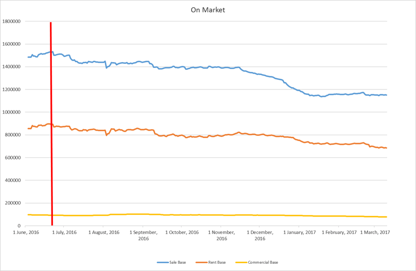
On Market Results: For Sale and Rental Base:
We can see from this graph that number of properties on the market For Sale and For Rent have been steadily dropping since the referendum. Unsurprisingly, For Sale properties more steeply dropped at Christmastime, reflecting typical consumer reluctance to market their homes during this period.
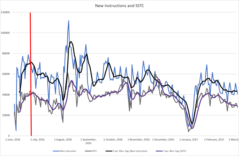
New instructions and SSTC:
The below graph shows the drop in number of New Instructions over the last few months, after a peak in August and September of last year. The number of SSTC properties has remained marginally more level, apart from a Christmas dip - though recently these figures are appearing lower than pre 23rd June.
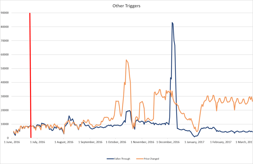
Fallen Throughs and Price Changes:
Finally, our last graph illustrates the major peak in the number of Fall throughs during the Christmas 2016 period. At the end of March this year, however the number of Fall Through properties fell below referendum levels. Property price changes on the other hand have risen dramatically since 23rd June 2016.
For further Brexit Analysis read our previous blog posts, Brexit: Leave vs Remain home mover data analysis and Property Market Update: Brexit and the UK housing market.
If you'd like to know more about TwentyEA's UK housing market data and other services, please call 01908 829300 or email enquiries@twentyea.co.uk


